I’m a junior developer who started coding for the first time after joining vooy. Our first product designer has yet to join, and I’m working with my teammates to build and improve the app’s screens.
We’re building vooy, a messenger where people and AI agents work together. You can manage your calendar through conversation and ask an agent to handle everyday tasks. This kind of messenger didn’t yet have an established shape in the market. There weren’t many products we could simply take our cues from.
All our developers were writing code with agents. Features arrived quickly, but the screens still felt awkward. Buttons worked, yet it wasn’t always clear which one to press. The same function could look different on every screen. The app kept growing, while improving the interface kept getting pushed back.
I wasn’t confident in my design skills either. So I decided to make enough screens for us to examine and discuss as a team. I would build both the designs and the tools to compare them with agents.
The biggest change came when we separated the agent that read the code from the agent that designed the screens. Only a feature specification passed between them. It took two experiments to arrive at that approach.
Less talk.
More screens.
Two experiments in making options, gathering feedback, and turning decisions into an interface.
Explore all 15 designs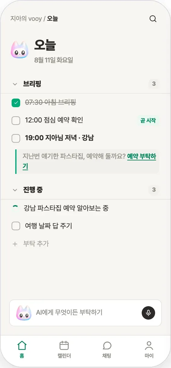
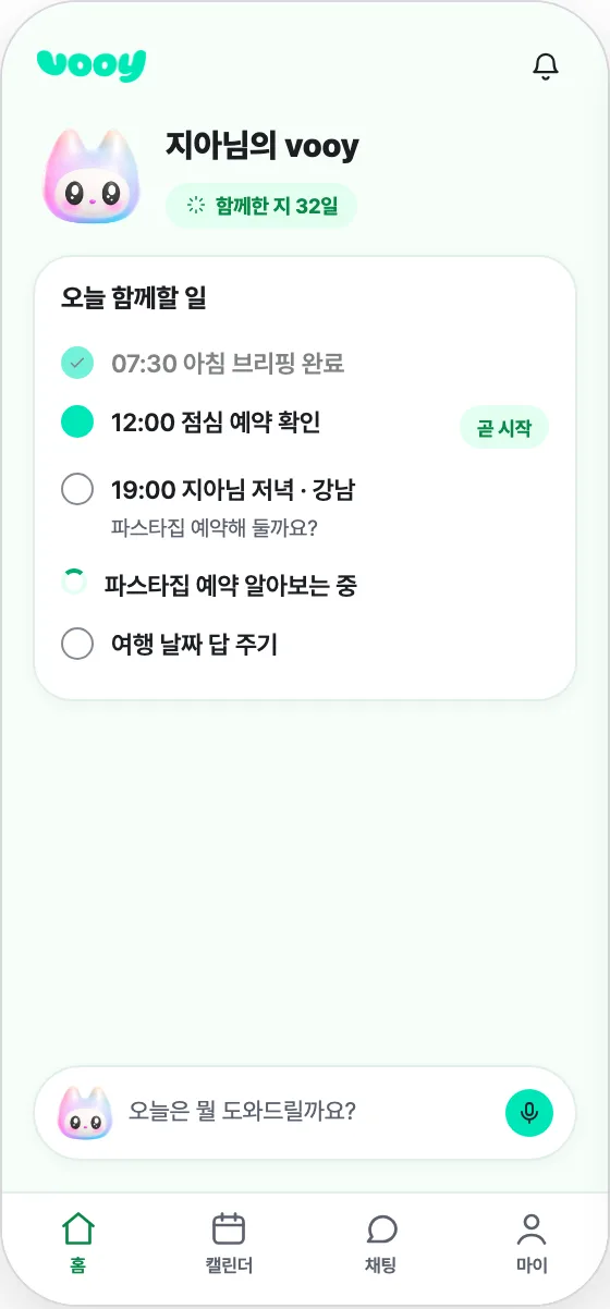
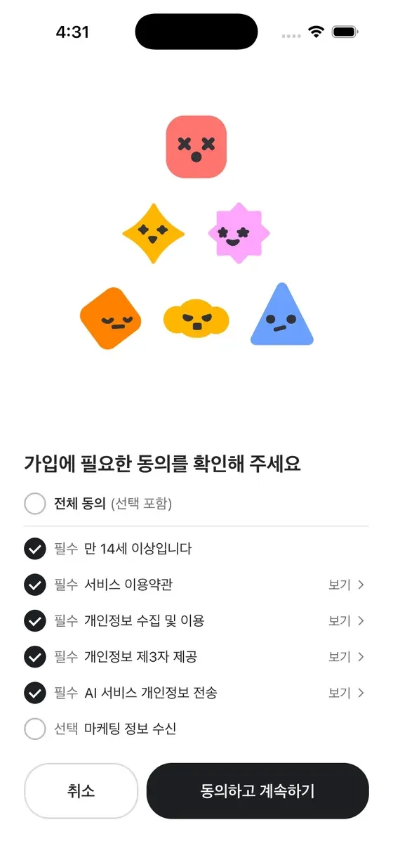
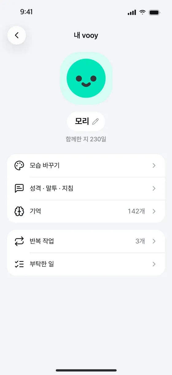
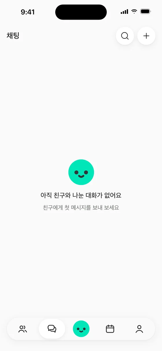
Instead of a design meeting, we put designs to a vote
“What should this screen look like?” was hard to answer in words. So we laid out 15 approaches to the same home, chat, and calendar screens. Some put the character up front. Others packed information together or focused on conversation. With something in front of us, we could discuss our differences in concrete terms.
There was no long preparation phase. I asked an agent to build the designs and the voting site, then deployed it to Vercel and shared the URL that night. Teammates explored the screens and rated them on a five-point scale.
What catches your eye?
A reconstruction of the original 15 designs. Conversations are mock data.
Scores alone didn’t explain why. So we let people click a point or drag across an area to leave feedback directly on a screen. Instead of stopping at “I like number six,” they could say, “I like how the character seems to speak to me, but it doesn’t need to appear twice.”
Positive comments gave us reasons to keep things. Negative comments showed us where to make changes. Here are three sets of real feedback alongside the consolidated designs they helped shape.
What works. What doesn’t.
The reasons behind the scores, marked directly on the screen.
10participants
124specific comments
Positive 39Negative 85
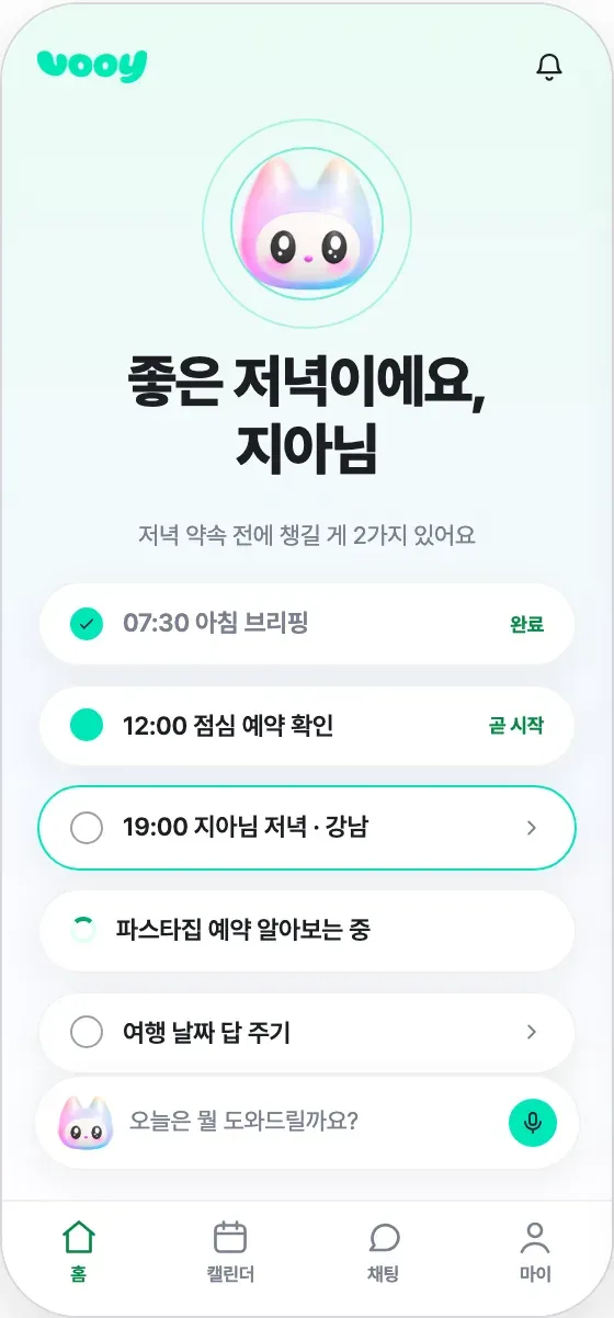
Prominent. Not repeated.
One large character stays at the top of home, with a direct route into conversation underneath.
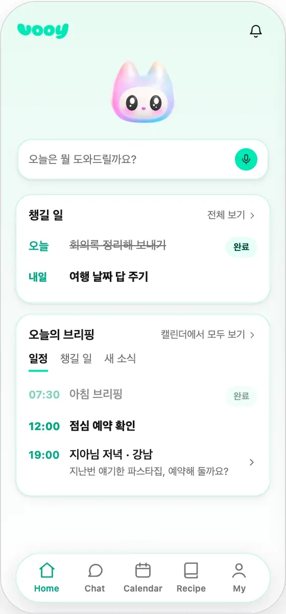
Ten people left 124 pins: 39 positive and 85 negative. I organized the feedback into 24 groups and handed the decisions to an agent. We combined them into one app draft with six screens, including home, chat, and calendar.
Building the voting tool, gathering feedback, and combining it into a design—a day was enough. With screens in front of us, the changes we wanted became clear quickly. Working with an agent meant we could put those decisions straight into the next version.
Separate the agent that reads the code from the agent that designs the screens
Choosing a direction wasn’t the end. As we developed the app with agents, more screens appeared, and awkward details grew between them. Similar settings had different spacing. Buttons carried different visual weight. Several sentences repeated what one could have said. Each issue seemed small in isolation; together, they made the app inconsistent.
Again, I turned to agent-driven development to improve the UI. But the moment an agent sees its own codebase, its UI originality drops sharply. Existing components, screen boundaries, and information order become the starting point for the next design. Even “design it from scratch” can turn into adjusting spacing and colors inside the same frame.
Code mixes two things: what the product must do and how the current interface expresses it. Sending a message and retrying after failure are behaviors to preserve. Where the input lives and how a failure appears are design decisions we can make again. Passing over the entire codebase passes on both.
So I changed the boundary around what the agent could read. One agent would study the existing app; another would design the new screens. A feature specification would be the handoff between them.
The research agent extracted actions, data, states, constraints, and dependencies from the code and actual screens, assigning an ID to each feature. Colors, layouts, component names, and button positions stayed out of the handoff. The source map connecting features to code lived in a separate file that the design agent would not receive. The agent needed to understand the function without inheriting its existing appearance.
Hand over the function, not the screen.
Retry a failed message
- User action
- Resend a message that failed to send. Update the delivery status based on the retry result and …
- Data
- Message ID, conversation ID, message content, delivery status, …
- States
- Sending · sent · failed. Keep the content if the retry also fails. If the connection drops …
- Constraints
- The same message must not be sent twice. If a request is already in progress …
- Depends on
- F-EX02 · Send a message
No prescribed colors, layout, or components.
Keep the source map separate.
features-sources.mdRecord where the feature came from, but keep that map out of the design handoff. Even a code path can lead back to the old UI.
Follow the feature ID.
The screen structure is designed anew. Mapping feature IDs to the new screens makes missing behavior visible, even when the UI changes.
An excerpt-style public example using the original document format, with illustrative features, IDs, and paths.
That specification became an input contract between the agents. In the example, F-EX01 preserves the ability to retry a failed message. Where and how to present that action is up to the design agent. We also excluded the existing code and capture directories from its scope so it would start from the feature specification.
The new starting point came from outside. The design agent received the specification and minimal brand material, such as the name and mascot. Using Mobbin MCP, it investigated patterns for conversation lists, calendar density, and empty-state guidance. It assembled screens from patterns that fit the functions, instead of fitting functions into existing components.
Once the design was ready, the same feature IDs were mapped to the new screens. For F-EX01, that meant identifying where the new conversation screen offered the retry action. The presentation could change, while IDs kept the required behavior traceable. After checking for missing features and selecting a direction, an implementation agent brought the design back into the existing codebase.
I called this UI Big Bang. We moved the starting point from existing implementation to functions and outside references, giving the agent room to design the app again.
109 screens in a day, then straight into app development
We started designing in the evening. Within a day, we had proposals for 109 screens ready to review. We compared directions and refined our choices around the app’s flows and visual tone.
What changed?
Notification and display settings come together, with theme and text-size controls in the same place.
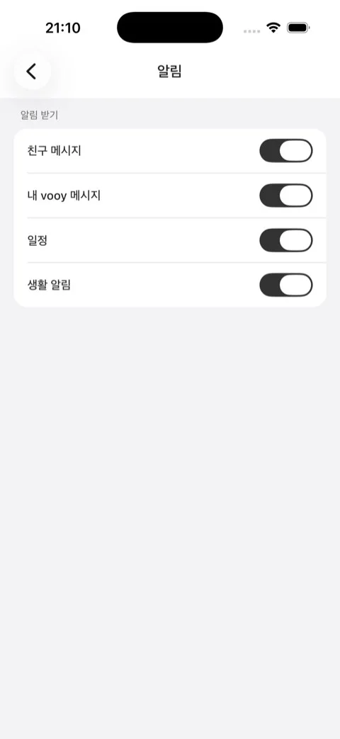
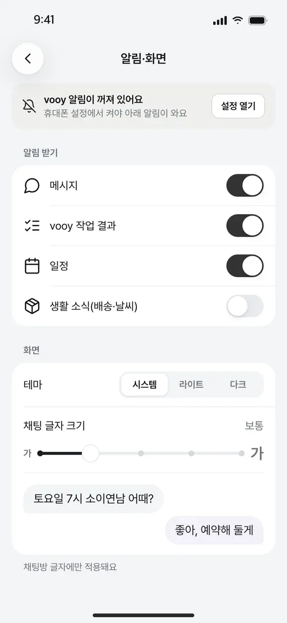
We refined the UI across the app, aligning its information hierarchy, visual language, and flows so moving between screens felt like using one coherent product.
The whole app, laid out together.
Now, instead of asking for “something prettier,” I could choose from screens. What read first? Was the next action clear? Did similar functions look consistent? Once I chose a direction, I handed the screen back to an agent. Choosing a design became a way to define the next development task.
From a decision to the app.
Choose the screen
Compare the designs side by side and choose a better direction.
Hand the screen to an agent
The chosen screen becomes the brief for the next development task.
Bring it into the app’s code
The agent brings the design into the code. Run it, try it, and refine it again.
We brought around 100 of those screens into the app the very next day. With an agent, of course.
My actual role is PM
I’m a product manager, and I’m also new to development. I started coding for the first time after joining vooy. I’m still learning every day, and I’m opening dozens of PRs a day.
What changed was how I work, rather than my title. Instead of handing over a request and waiting, I can put the idea on screen, gather feedback, and take part in bringing it into the app.
That makes an eye for what is good more important to me. What should people see first? How can the next action feel natural? What principles should hold the whole app together? Making so many screens brought the design questions we needed to explore more deeply into focus.
vooy’s screens keep changing from one day to the next. In some organizations, this might look like overstepping your role. At vooy, everyone rolls up their sleeves when there’s a way to make the product better and help it grow. We find the work that needs doing and give it a try, wherever our job titles might place us.
You’ll soon be able to find vooy on the App Store and Google Play.
We’re looking for a product designer to continue these experiments with us. Here, you can set the design principles and bring them into the product with agents and unlimited tokens. We’re also hiring for other roles. If you’d like to build with us, we’d love to talk.
DESIGN AT VOOY
We’re looking for a product designer
Join us in designing vooy’s screens with agents.